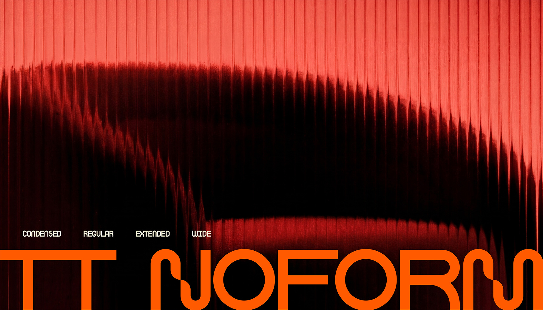
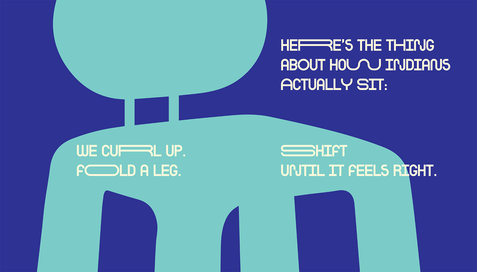
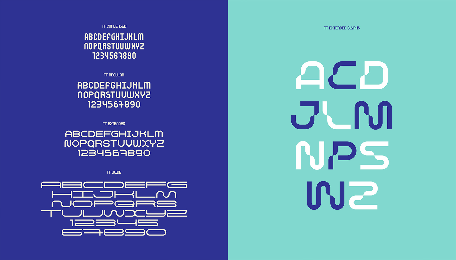
The goal was to capture all of that and fold it into a contemporary type system that still carries a pulse: clean in structure, functional in spirit, but twisted around the edges, like something that has moved out in the open. Its four variants(Regular, Condensed, Narrow and Wide) shift in width the way form should feel.
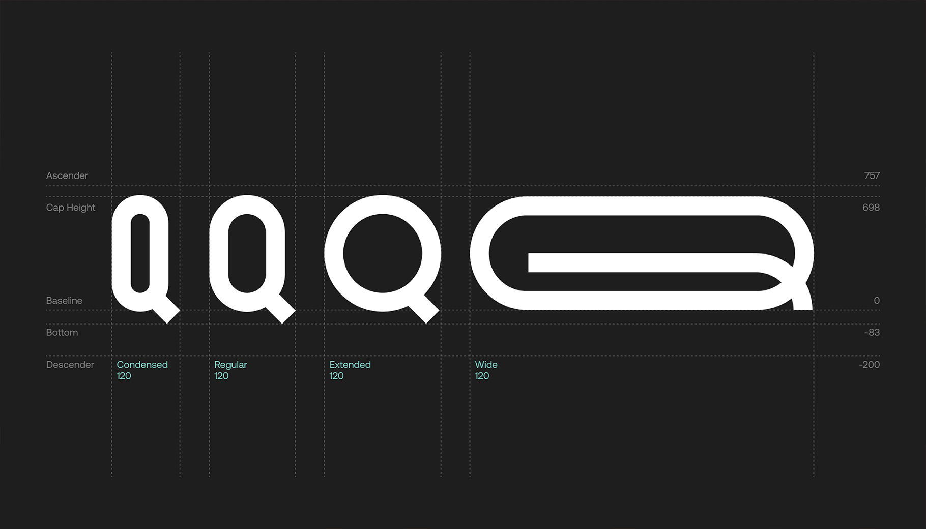
TT Noform is built as a four-variant system. The fonts were drawn with deliberately different widths to represent the flow of thoughts and also comes with glyphs on the extended variant for those ideas taking shape. Despite these differences, the family maintains a strong sense of consistency across styles, allowing it to work as a display typeface for the brand.