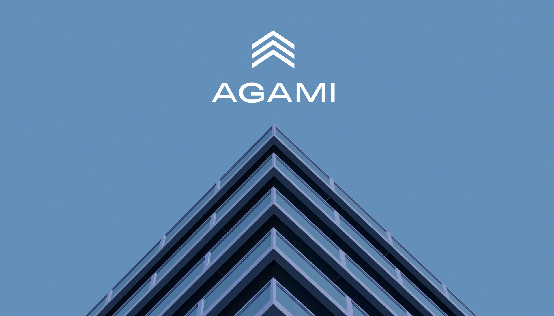
When Agami partnered with Truetype, the objective was to refine how the brand was expressed. The existing logo leaned towards a technology-led look and did not fully reflect Agami’s real estate roots. The task was to create a brand language and identity aligned with the brand’s values of integrity, longevity and people-centric development.
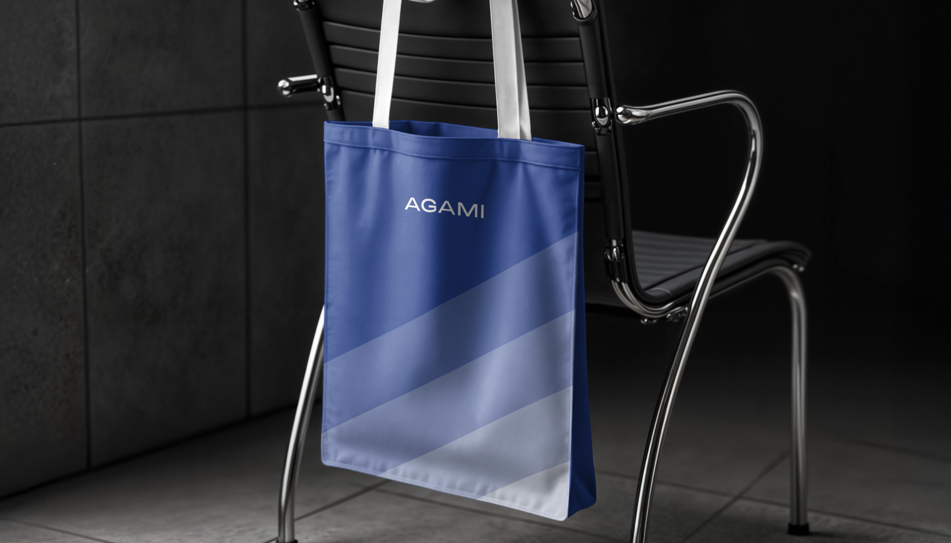
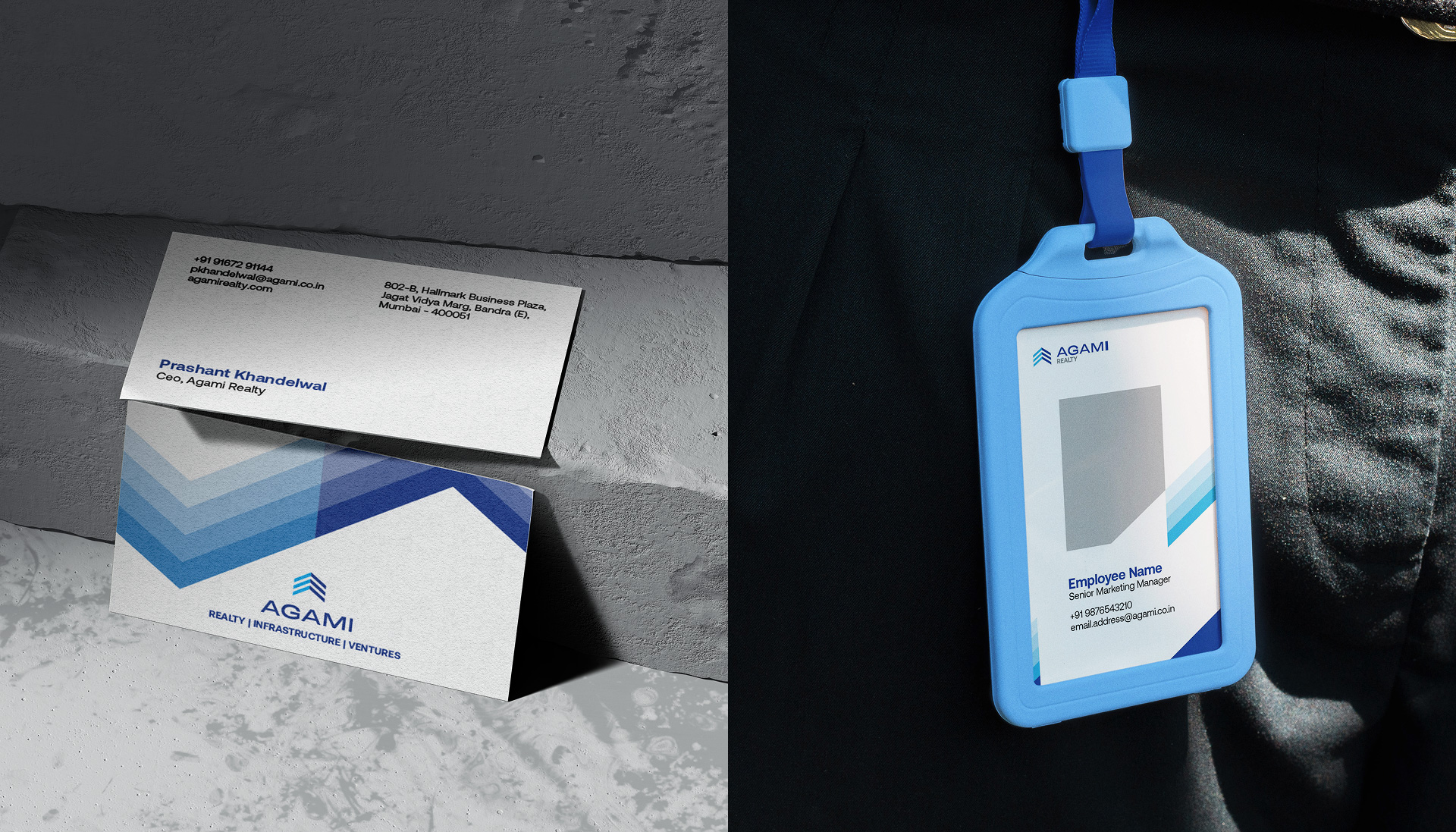
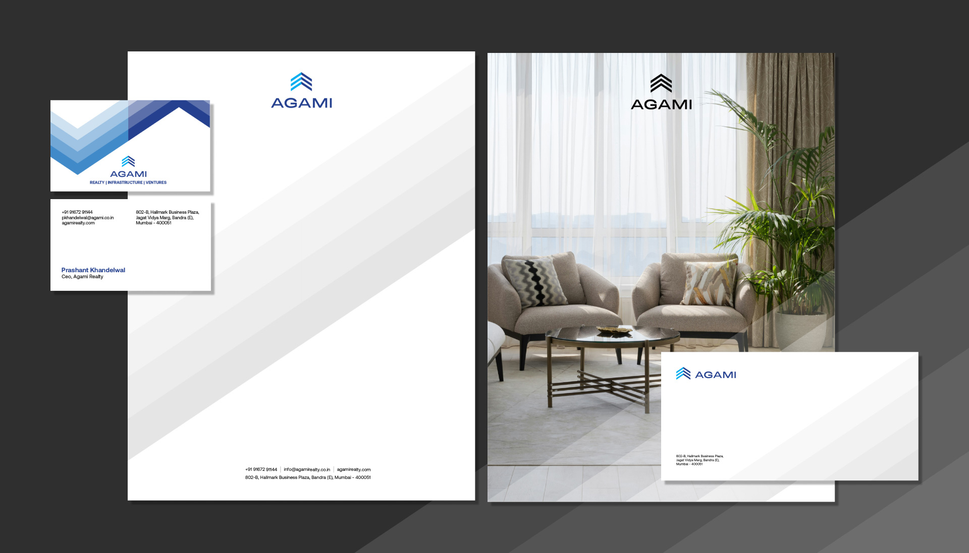
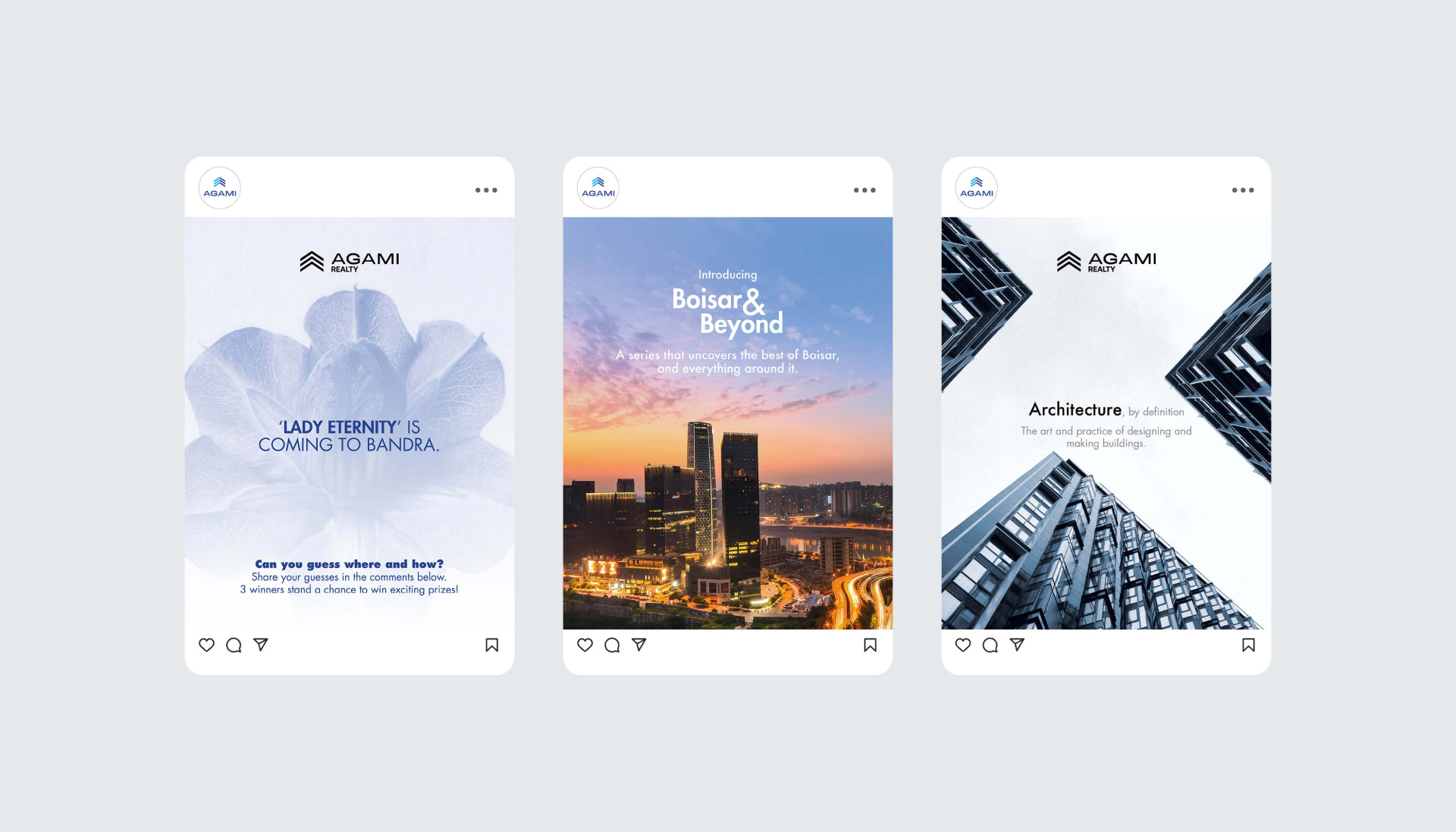
The rebranding began with the logo typeface, which was refined to feel more balanced and circular, lending it a sense of stability and continuity. As the arrow mark was already recognised as a key part of the brand’s identity, it was retained. The shift moved the identity from a technology-driven look to a more human-driven one, supported by more robust and approachable typography. This was followed by a new set of visual guidelines, applied across all media including digital, social media, outdoor and print, to create a cohesive visual language that reinforced thoughtful living and long-term value.